

Fontastic!
A Paean to the Typeface

If you can talk about fonts, you can talk to anyone. —Brick Heck, “The Middle”
I geek out on fonts.
In all seriousness (ask my husband), I bought my car because of a typeface. Those red BRONCO letters against the white grille of my baby-blue Heritage SUV made my heart flutter.

My fondness for fonts began at a young age, thanks to my mom, who taught me to appreciate good art and design. She was a painter, an interior decorator, and the owner of the architectural firm that designed Brooks Robinson’s house.
Milton Glaser was a constant presence in my childhood apartment, where several of his framed posters hung and where the logo he designed for New York Magazine was delivered to our door weekly. His poster for Bob Dylan’s Greatest Hits made him a rockstar in his own right. (Seeing the designer of the Baby Teeth typeface speak at MICA in the eighties was like going to a concert, with the harmonies of excellent design singing to my soul.)
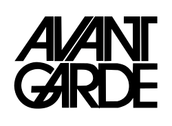
I knew Herb Lubalin’s name before there was an internet. (He designed one of the best typefaces in the world: Avant Garde. The glyphs are to die for!)
In high school, I took a graphic design course with art teacher and clockmaker Ed Smith (RIP), where I designed two typefaces, a business logo, and a stationery package. I loved the process, the planning, the precision of making design elements work together. Ed wrote on my typeface submission: “Stupendous! Outstanding! A+++!”
Still, I was a writer first, and that’s what I studied in college. I wrote music reviews for our college paper, and my poetry was published in our literary magazine. By the time I had graduated, I had a few national publishing credits under my belt and was giving poetry readings on nights off from my new wave band.
In the late eighties, I saw a cool poster with Edgar Allan Poe on it at the University of Baltimore’s table at the City Fair. I pretended to be interested in attending and grabbed a course catalog so I could get the free poster. But when I got home and learned about their new Publications Design program, I was hooked. I was accepted the following September and earned my first Master’s degree in the marriage of written and graphic content.
Having a graduate degree in design made me a better designer—and much more employable. I knew with my skills, which included photography, a new world would open up for me. And it did. My first big-girl job while I attended grad school was with a one-man advertising agency. (My cover letter began, “Oooh! Pick me!” and he did.) I gained experience in copywriting, radio- and TV-script writing, pasteup, and production. Once I graduated, I moved to a design studio, where I made logos, menus, ads, and oodles of printed materials.
My husband used to joke that I colored and cut and pasted all day (this was before desktop publishing, when we had to buy Letraset and Chartpak dry-transfer letters for mockups and send things to typesetting houses). Although he jokingly belittled it, he was right. It was fun and never felt like work.
Since then, I have designed dozens of logos and stationery packages, websites, ads, brochures, flyers, album covers and liner notes, posters, postcards, and cards. My protest signs, mostly parodies of familiar works that relied on font recognition, were always a hit. The last thing I designed for fun was a new band logo—last week. The week before, it was a satirical Christmas card. My laptop and seven old hard drives are full of my designs.
The medium is the message. —Marshall McLuhan
Good design relies heavily on the fonts to impart a feeling that is consistent with the message. McLuhan’s theory—that the medium you use to convey a message, whether it’s TV, radio, or a billboard, is the message itself—might be difficult to grasp, but here’s a clearer explanation in his own words:
The title “The Medium Is the Massage” is a teaser—a way of getting attention. There’s a wonderful sign hanging in a Toronto junkyard which reads, “Help Beautify Junkyards. Throw Something Lovely Away Today.” This is a very effective way of getting people to notice a lot of things. And so the title is intended to draw attention to the fact that a medium is not something neutral—it does something to people. It takes hold of them. It rubs them off, it massages them and bumps them around, chiropractically, as it were, and the general roughing up that any new society gets from a medium, especially a new medium, is what is intended in that title.”1
The same holds for fonts. They should feel inseparable from the message. They should move you. They should convey the emotion the designer wants you to feel. They should manipulate you and spur you on to buy that Ford Bronco, not just because Ford is a reliable name in automobiles you can trust, but because the way that name is presented is so fucking attractive!
Your choice of font says more about you than the words it’s written in. —Brick Heck, “The Middle”
Like most things design, typography is a matter of personal taste. But font psychology is a thing! So are the well-founded rules on how to use typefaces and which ones work together and which absolutely do not. (And there is nearly universal agreement on Comic Sans and Papyrus as typefaces that should only be used to make fun of them.*)
Here are my three favorite rules of typography:
Use no more than three different typefaces in one designed piece (fonts are actually the styles of type within a typeface; e.g., Helvetica is a typeface; Helvetica bold is the font).
Use left-aligned type. This graphic is a perfect example of why. Unless you’re writing a book and are using programs with extra controls over how typography works, your flush type is going to look like a mouth with missing teeth. It’s awkward and clumsy, and, worse, it makes reading more difficult. With ragged-right type, keeping your place as you read is simple thanks to the visual cues held in the line length. (This is a huge debate in the legal field, as some lawyers find justified type serious and formal, while others find left-aligned text just as professional but easier to read.) If you must justify, turn on hyphenation!
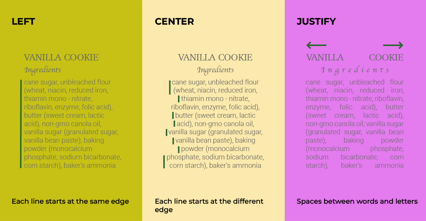
Use the appropriate symbols for hyphens and dashes. Hyphens are short; their grammatical function is to join two words to make one: well-oiled machine. They do not interrupt with an important thought—like an em dash (the width of the letter m in the font you’re using), nor do they indicate a span of time, 7 AM – 7 PM, like an en dash (the width of the letter n, often used with spaces before and after). This is one of the hardest concepts to grasp, especially for non-writers.
Corporations spend tens of thousands of dollars or more on outside agencies for branding. A final package usually includes rules and restrictions about the use and size of the logo, lettermark, and wordmark; official corporate fonts to be used in external marketing and advertising (sometimes with acceptable substitutions); official colors, which should be identical, not close enough; iconography; stock photo style samples; and a presentation deck.
Replicating and enforcing brand guidelines is a top responsibility for senior marketing professionals. They set the example for everyone who works at a company. Marketing is responsible for ensuring that every employee’s corporate signature looks the same (and doesn’t have whimsical stationery backgrounds or favorite bible quotes), for supplying marketing-approved logos to other departments and vendors; and for ensuring that any branded item seen by the outside world (a form, an ad, a contract) is uniform and uses the correct fonts and colors. (Who loves a template? Me!)
Why? Ask just about anybody. Fonts may be decorative, but they’re not for decoration. They’re for consistency, reliability, trust, credibility, loyalty, and cohesion. They’re not just my hobby; they’re my responsibility. They’re my job.
And it would be a good time to admit that the name I picked for my son was Garamond Bodoni. Gary B. Miller has a certain ring to it.
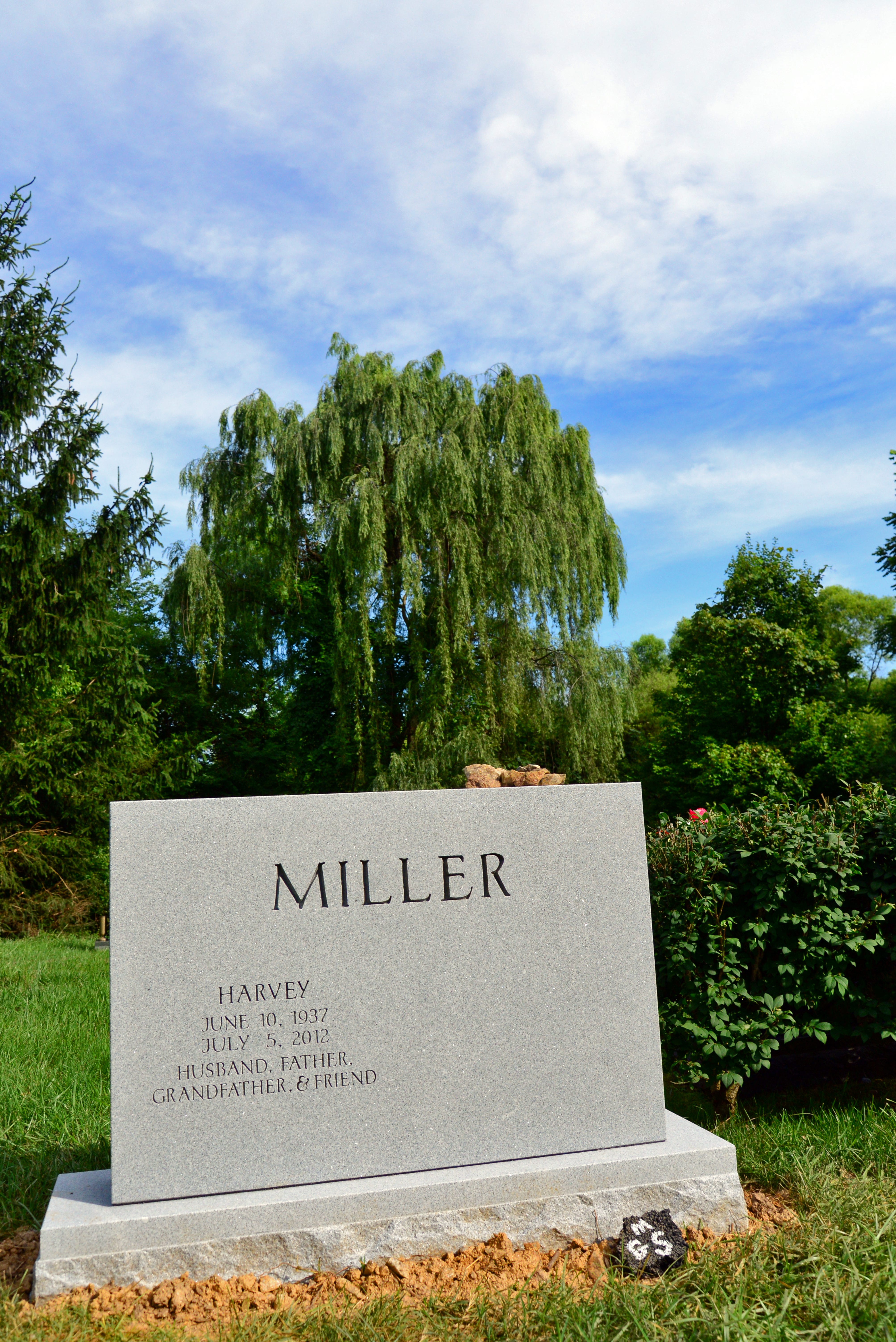
My mom, who’s still into fonts, wants me to remember Folkwang. It’s what she wants on her headstone.
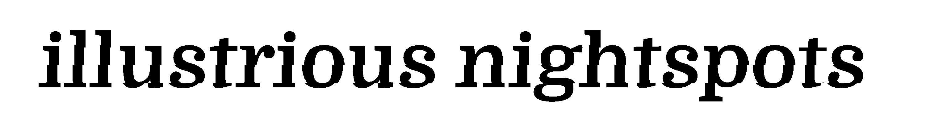
For a serious understanding of the importance of typefaces and their fonts, we turn, of course, to comedy.
And this old favorite:
*Even Chris Costello, designer of Papyrus, agrees that it’s overused.
A column after my own heart--I love you more than ever! My dad was a graphic designer, so I grew up with this stuff (and those great magazines). My first job was as a production assistant at a (pre-phototypsetting) book publisher. I eventually became a copy-editor. and then went into marketing and branding queendom.
Excellent article!